Capture One Color Balance
Capture One Color Balance is a sophisticated tool for creative toning of color images. You add a color tone for Shadows, Midtones, and Highlights separately, each with its own Color Wheel. Each wheel has controls for Hue, Saturation and Lightness.
Capture One Color Balance
The Capture One Color Balance tool is your next stop after the White Balance adjustment in creating the utmost in color in your images. Color is an important messenger of mood or atmosphere in your images. Color brings the message across, color is emotion. After all, we all love a good sunset, don’t we?
We will take a close look at the Color Balance tool, explore how you can best handle it and last but not least what you can achieve with it. So let us start with an example.
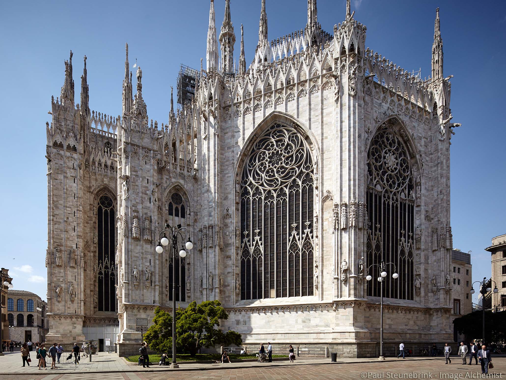

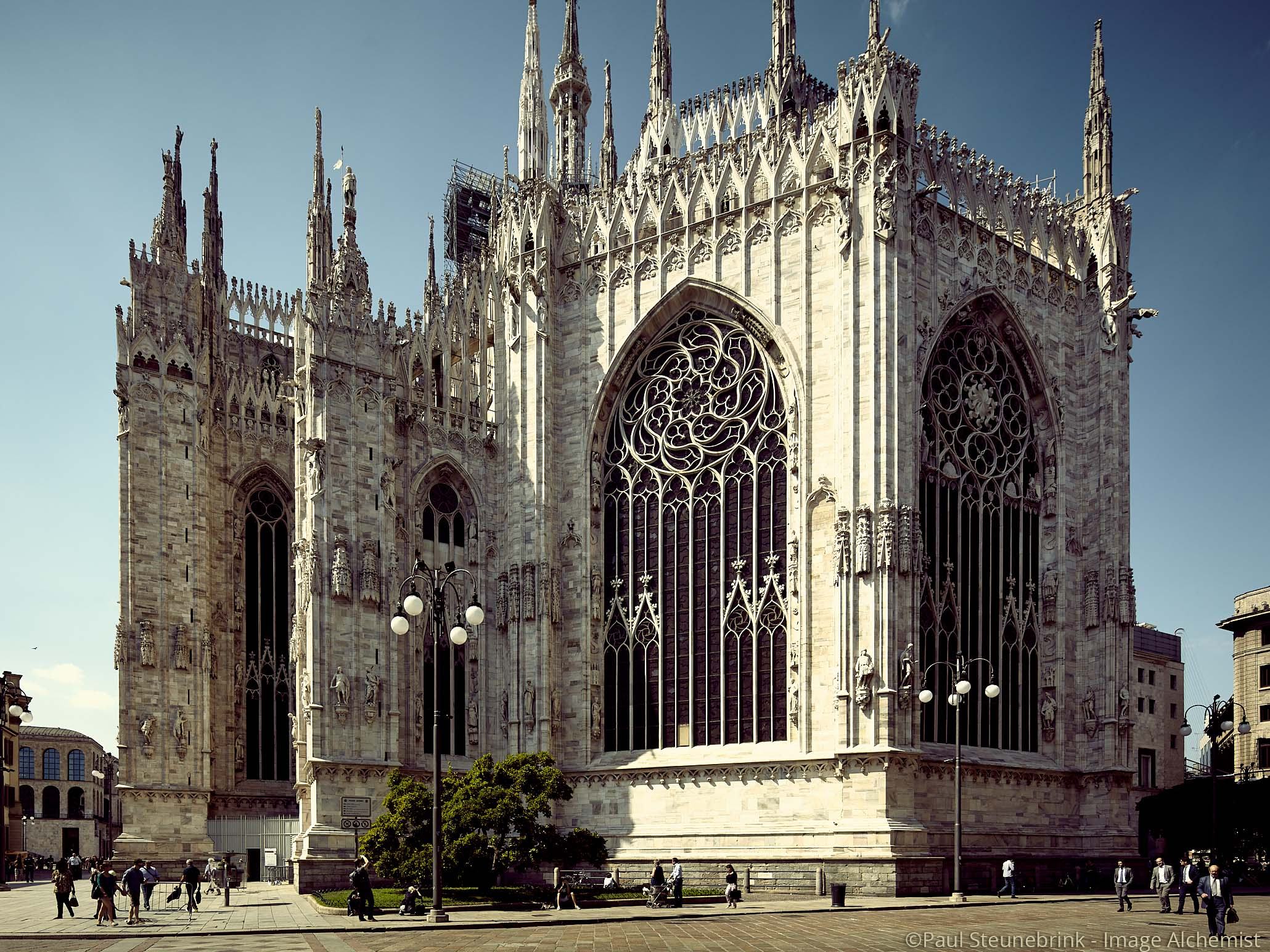
In the before/after stacking of images above, the before (left) image is adjusted with the White Balance tool for a neutral color. The after (right) image got an additional treat from the Color Balance tool to create a specific mood. This is known as color toning.
The following adjustments were applied to the image:
I will explain the working of these Color Wheels into more detail in this post.
Anatomy Of The Tool
Before we continue I like to notice that the Color Balance tool is part of Capture One Pro/Pro Fujifilm/Pro Sony and DB, and not available in Capture One Express Fujifilm/Express Sony.
The Color Balance tool is part of Capture One since the beginning. But hardly anyone was using it. That changed not so long ago when it got a great make-over that unleashed its real potential as a color toning tool.
Layout, functionality, and underlying algorithms of the tool were changed. That was in Capture One Pro 8.2 in March 2015.
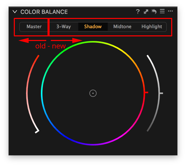
For that reason, it now actually consists of two similar tools, the old Master Wheel for legacy reasons, and the new 3-Way Wheels for real creative toning. You find the different Color Wheels under the respective tabs in the tool.
The Old Master Wheel
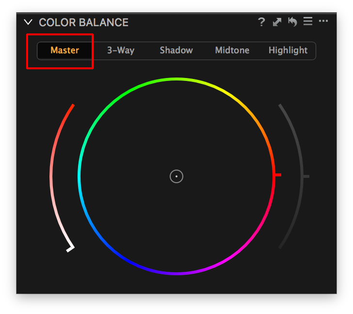
The Master Wheel at the Master tab mainly serves its purpose for images adjusted with the Color Balance tool in versions prior to Capture One 8.2. In other words, you can still use it but it sits there for legacy reasons.
I have used the Color Balance tool in the past for images from CCD sensors that had a nasty (typically greenish) color cast that could not be corrected with the White Balance tool.
The Master Wheel affects the colors in all areas from bright to dark equally and that is not the flexibility we need today for real color toning.
To summarise, the Master tab is there for legacy reasons but apart from that, you’d better forget about it at all.
The New 3-Way Wheels
The new Color Balance tool was introduced in Capture One Pro 8.2, and differentiates from the classic Master version in three important ways:
- separate color toning for three brightness levels Shadow, Midtone, and Highlight
- additional Lightness control for all three brightness levels
- new processing algorithms
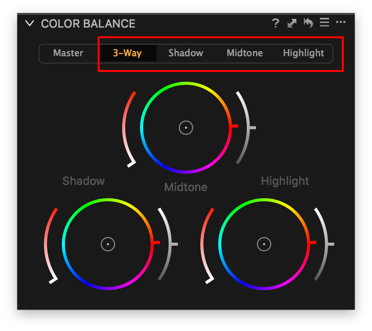
You can use this coloring trinity via their respective tabs – Shadow, Midtone, Highlight – or via the combined 3-Way tab.
The 3-Way tab shows all three Color Wheels for a better overview but the respective Shadow, Midtone, Highlight tabs show larger wheels that are easier to handle.
Floating Tool
Are you familiar with floating tools? You can float each tool and place it anywhere on your display. You create a floating tool via Window menu > Create Floating Tool or by dragging the tool from the tool tab.
One special feature of the Color Balance tool when floating is that you can enlarge it for very precise adjustments. Just drag each of the edges or corners into the desired direction.
Yes, I enlarged it a bit too much in the screenshot above, but you got the message.
Vectorscope
Another layout feature that was introduced in Capture One 10.1 is the Vectorscope layout of the Color Wheel. It is a setting in the Preferences, Color tab.
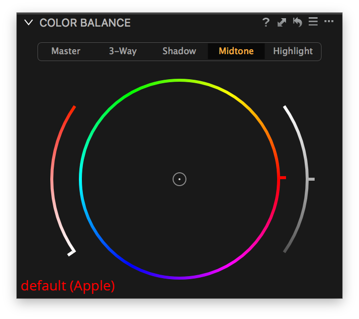
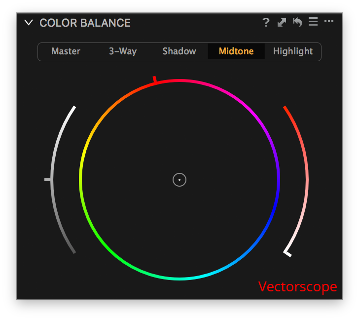
With Vectorscope, the Color Wheel is rotated so that red is at the 12’o clock position instead of the (Apple) default at 3’0 clock position. Also, note that the Saturation and Lightness controls reverse when you change layout type.
Using The Color Wheel
Okay, let’s have some fun. Take a few steps.
- Select an image to mess around with (maybe create a Clone Variant first);
- view it Full Screen;
- open a floating Color Balance tool (Window menu, Create Floating Tool > Color Balance);
- position the tool, enlarge it if necessary, and select the Midtone tab.
We will now start adjusting the Saturation, Hue, and Lightness.
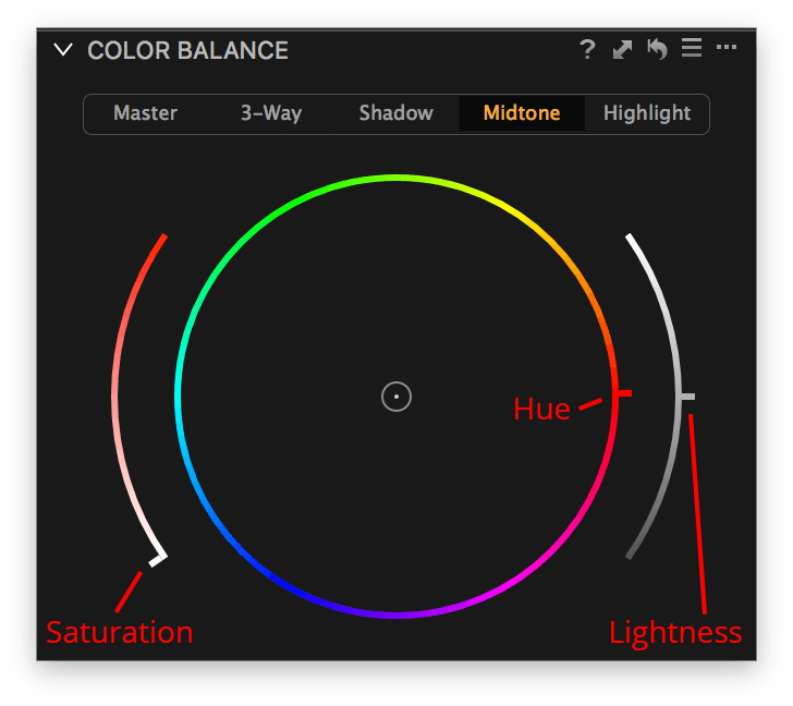
At the left, you see a curved shape, the Saturation control handle. Drag the handle upwards and notice the coloring of the image and the circular shape in the center of the wheel moving towards the outer circle. Position the Saturation halfway, say 50%.
Next, move your mouse to the Hue control handle at the Color Wheel. The default position is at red, 3’0 clock. Move it up or down and move it around the entire circle. Watch the changes in your image closely and see how the small circular shape inside the wheel moves along.
Last, go with your mouse pointer to the curved shape at the right, the Lightness control. Grab the control which is in the middle position and move it up and down while you look at your image. Notice how gentle Lightness in the image changes without clipping your image.
Repeat the steps for Hue, Saturation, and Lightness at the other two tabs, Shadow and Highlight and review the result.
Tip
One last trick before we shift gear. If you have a trackpad or similar device, try to move two fingers up and down while the mouse pointer is on one of the three shapes. It allows for a very smooth adjustment while keeping your eyes on the image.
Another option is to use the pro-grade Tangent hardware. I tested and reviewed it and it is awesome but it comes at a price.
A cheaper alternative is a range of Presets, which I will discuss in a moment.
Using Color Balance Presets
A Preset is a pre-defined adjustment for a specific tool. The renewed Color Balance tool comes with a nice series of built-in Presets with fanciful names like Cold Orange, Purple Punch, and Velvety Warm. Check them out, they are nice.
You can, of course, create your own Preset. Go to the Tool Controls in the upper right corner and click on the hamburger (three horizontal lines). Choose Save User Preset and fill in a meaningful name. As you might notice a Color Balance Preset stores the settings for all four color wheels. The tool does not let you differentiate between Color Wheels when storing and applying a Preset.
Fortunately, it is possible to do that and stack multiple Presets for the respective Color Wheels. That is exactly what the Image Alchemist’s Presets for the Color Balance tool does.
Image Alchemist’s Presets
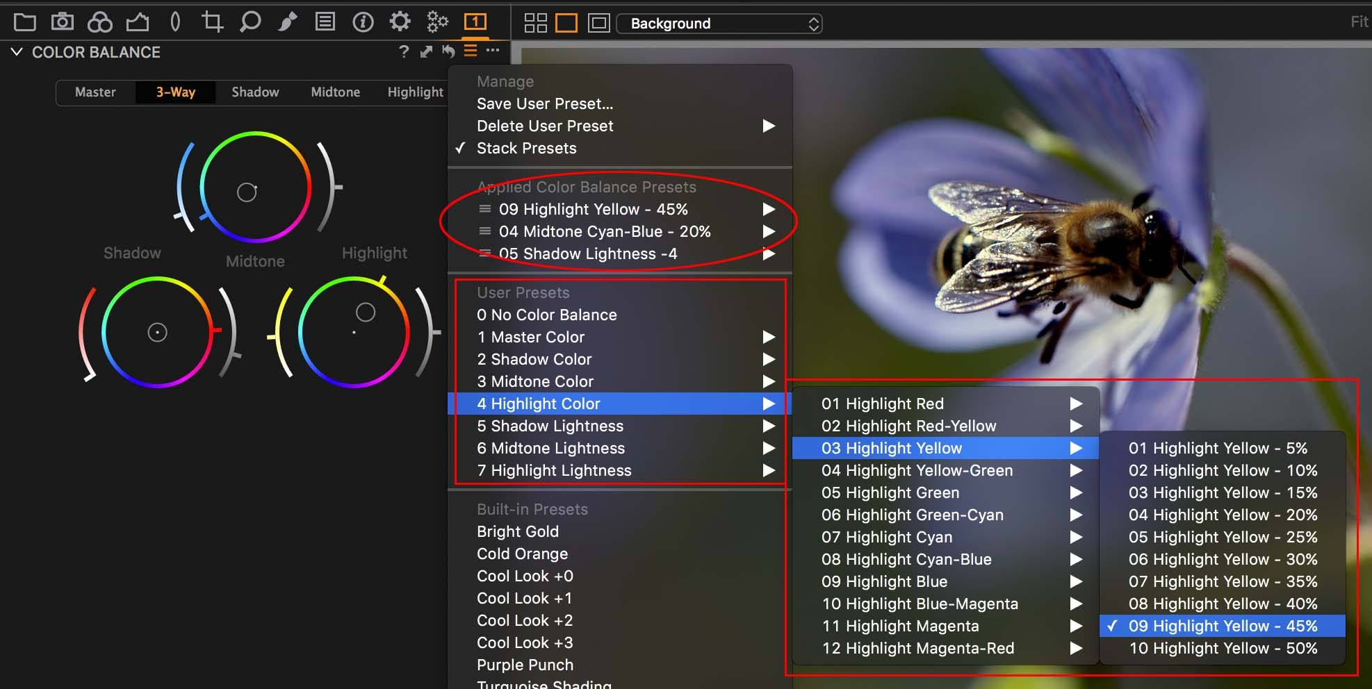
The screenshot below gives you a quick impression of the Capture One Color Balance Presets available from this website. It is a huge collection of over 500 Presets with a smaller subset as a free trial. It contains separate Presets for coloring and for Lightness adjustments.
Color
In this Image Alchemist package, there are sets of Presets for each Color Wheel – Master, Shadow, Midtone, and Highlight Color – varying in Hue and Saturation. You can control each Color Wheel separately.
When you Stack Presets, you can combine a Preset per Color Wheel without overriding any other Preset or manual setting. This gives you total freedom and control in color toning. See in the screenshot above under Applied Color Balance Presets.
The two stacked images below only differ in their Color Balance adjustments.
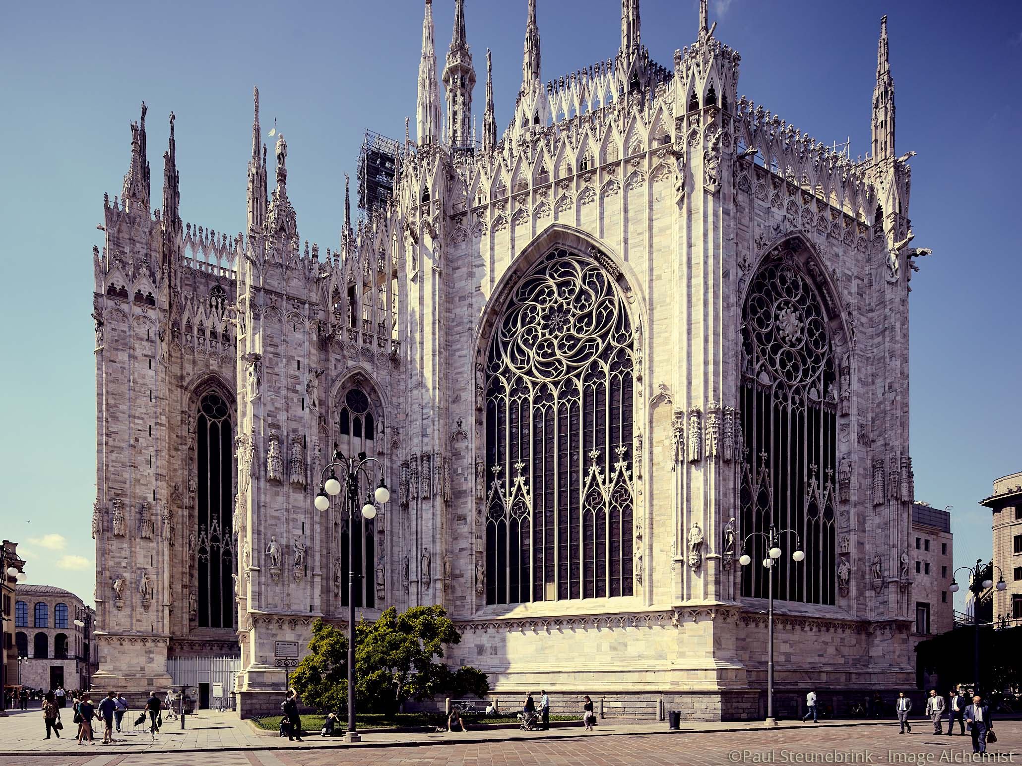
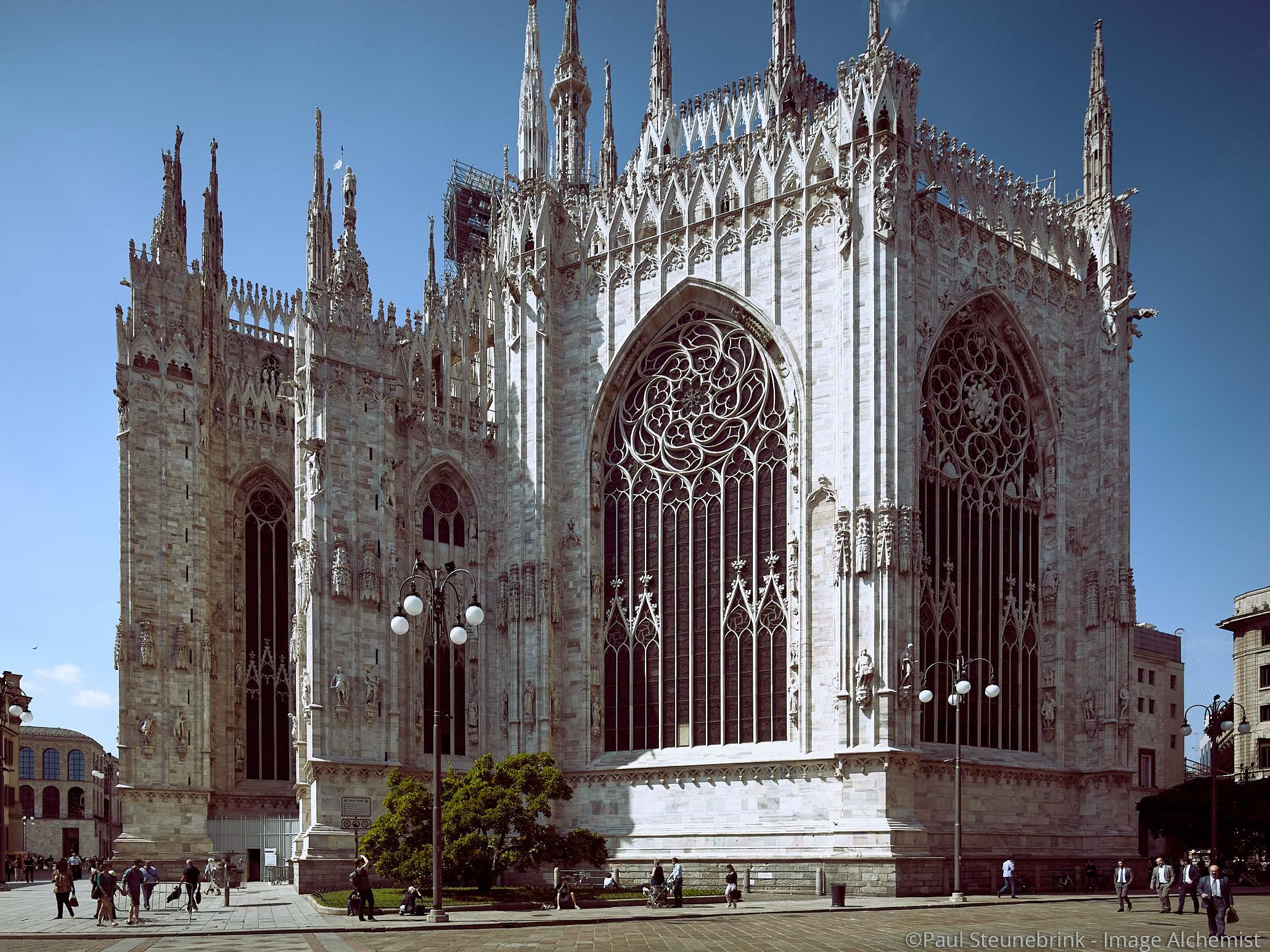
Presets have the big advantage that when you hover over them you see the effect before you click to apply one.
Lightness
In addition to Color Presets, there are also sets of Presets for the Lightness controls. As you now understand, this only applies to the three new tabs Shadow, Midtone, and Highlight.
In the example of the Milan Cathedral above I made both Color and Lightness adjustments on all three tabs Shadow, Midtone, and Highlight.
The same advantages for Presets as mentioned above apply here as well. The Lightness control looks very similar to the High Dynamic Range tool at first sight. However, it has actually more resemblance with the Curve tool but much easier to handle. Either way, it has its own unique look.
Two Notes
To round up this tutorial on the Capture One Color Balance tool two notes of interest.
- First, the Color Balance tool is great for toning color images. It does not work for black & white images. Don’t worry, the Black & White tool in Capture One is fully equipped for that!
- Second, you can reset either all adjustments on all tabs or just the selected tab. To select all adjustments on all tabs, just click on the curved arrow symbol top right. For selective reset of only the selected tab, Cmd-click on the curved arrow symbol.
Thank you
For reading. Please feel free to leave a comment. Like us on Facebook or subscribe to our newsletter to stay informed about new blogs.
Best Regards,
Image Alchemist





Hi!
I have used CO since version 4 and also have got some use of the color wheel as I have used it for removing color tint. There where an article some years ago (written by the professor?) telling have to compensate for unwanted color ting: Just move the point opposite the color you want to reduce.
This is a very user-friendly principle and makes it easy for those people not familiar with complementary colors.
br
Per Ulrik
Thanks Per, that is a great tip!
Best Paul Steunebrink / Image Alchemist
Hi Paul,
Your tip about the two finger control of a trackpad is excellent. Thanks for that – I keep forgetting to try these combinations in C1 – usually something good happens …
… which prompted me to play around a little.
If you make Hue active by clicking in the circle somewhere the two finger adjustment works along the line of the radius indicated by the Hue “adjustment tag”.
On a PC,
Ctrl + 2 finger scroll moves temporarily to the Hue colour selection tag around the circle.
Alt +2 finger scroll switches temporarily to the Lightness adjustment.
This is for V9. I assume V10 will offer that and maybe more.
You perhaps know all of this but did not mention it to avoid confusing people with so many options.
Great blogs as usual.
Thanks.
Grant