Capture One Pro 8.2 Review
In this Capture One Pro 8.2 review we look at the revisions and refinements in the second point update of Capture One Pro 8. When I looked into these changes for the first time, I would say it is a ‘pro’ update, meaning that it will mostly attract the professional user. I might be wrong about this. In particular the renewed Color Balance tool will attract the Instagram-type of user, which is more a label for a way of expressing yourself through images through a specific mood or atmosphere.

Capture One Pro 8.2 Review
A quick overview of the highlights of Capture One Pro 8.2 is the new Color Balance tool, support for high-density displays, and dynamic location on import or output. Next to that, some minor but not less relevant changes are an adjustable threshold for auto-level clipping and some user interface improvements. Last but not least, there is always a lot under the hood that is not visible to the eye but intended to improve the user experience with the program.
And of course, there are several new camera raw file formats supported, tethering for the Nikon D750, and lenses for lens corrections.
Color Balance
To start this Capture One Pro 8.2 review, we look into the renewed Color Balance tool.
Ever used the Color Balance tool? Perhaps not. I seldom, if ever, get a question about it. I use it occasionally to remove a color cast that I was not able to control with the two white balance sliders, Kelvin and Tint, but the occasions are rare. Do I use it for adding an atmosphere to my images, a warm or cool look as suggested by the presets? No.
Phase One must have been aware of it while realizing the potential of the tool to add a specific look through toning. Feature requests from migrating users coming from a competing platform might have helped as well.
Experienced Capture One users now that the separate Red, Green and Blue channels of Levels and Curve tools can be used for toning a color image but they are not easily accessible for the not so sophisticated user. By the way, I covered that topic here.
The New Color Balance
Enter the new Color Balance tool! There are actually three aspects of this tool that can be regarded as new. I will discuss them in succession.
New Design
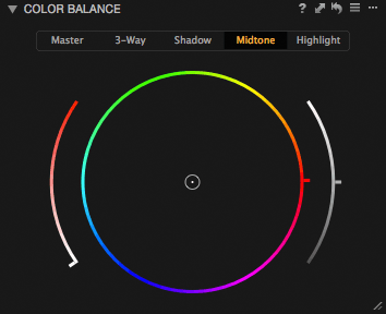
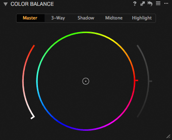
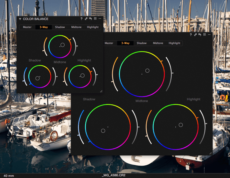
First, the design of the user interface of the tool is clearly different. A new flat and minimalistic design is in line with similar user interface changes in both Capture One as well as OS X and Windows. The color circle is outlined and has also become a handle for the Hue adjustment. Smart, I love this integration of form and function!
The Saturation adjustment is a colored curved line at the left of the circle and the color adapts to the selected color on the circle. How cool is that? And what about the curved line on the right? I’ll come to that in a moment but for now, notice that it is disabled on the Master tab (image above).
New 3-Way Adjustment
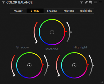
Second, you now can easily apply color toning to different brightness levels of your image. The separate Shadow, Midtone and Highlight tabs, as well as the cumulated 3-Way tab, clearly show that. Put differently: the 3-Way tab includes the three separate Shadow, Midtone, and Highlight tabs.
That is great for an overview but less attractive for adjusting. Fortunately, there are separate tabs for each circle. Conclusion: Color Balance has matured. Create your own look and add them to your images with a click. You sure want to work with presets on this tool.
Note that the Master tab is the original tool that has been there since Capture One 4 (and earlier, actually). And before you ask, yes you can use both the Master tab adjustments and the 3-Way tab adjustments in one image.
New Lightness Adjustment
Third, the 3-Way adjustments, both on the accumulated tab as on the separated tabs, have an additional adjustment for lightness. This one is something I still have to get used to, to be honest, but it does not hurt to leave it alone. It has been beneficial for example for toning highlights which are not very effective because they are highlights… Bringing the lightness down makes the toning more apparent.
How to use the new Color Balance tool?
I would leave the Master tab for backward compatibility only, never use it again from today onwards. The fun really starts with the 3-Way tab, and their respective separate tabs, because you can color tone the dark and bright part of your image individually. Phase One has made some nice new presets that take advantage of the new feature with lovely names like Bright Gold, Cool Orange, Purple Punch and Velvety Warm, among others. I encourage you to try them out to get the taste of it.
Note that the featured image (on top) of this blog was colored with the Purple Punch preset.
Tip
Now the Color Balance has multiple tabs, there are two ways to reset adjustments made by the tool: reset all tabs or reset selected tab. With the curved arrow symbol on the tool’s header, you reset all tabs. Command+click (Mac) on the arrow will reset the selected tab only (Ctrl+click on Windows).
There is actually a fourth new aspect to this tool, but I will uncover that in a minute (spoiler: see User Interface).
Dynamic Locations
The second most important feature in this review of Capture One 8.2 is the dynamic locations feature or the use of tokens in path names.
Pathnames are the names of subfolders. And yes, you can use a sequence of subfolders with tokens for the respective parts of your path. Sounds awfully technical and complex, so some examples, please! Let’s start with the import folder.
Dynamic Import Locations
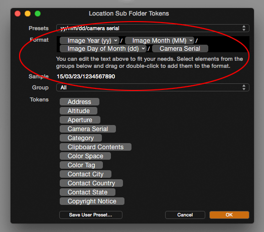
You now can use the image data, instead of the import date, during import and export of your images. I begged Phase One long enough for this, and now I am saved. This could have been a simple option in a drop-down list, but with the tokens Capture One goes the extra mile and more: total flexibility and control. You can create a complex path of folder names to fill your needs.
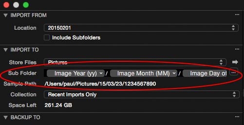
To create multi-level subfolders, just separate the term with a slash (Mac) or backslash (Windows). In the example image above I made a path of subfolders of year/month/day/camera serial. When I have a shoot and use two cameras the images will be automatically separated on import. The new subfolder field in the Import Images dialog looks like this:
This was one example of import with dynamic locations. Let’s see what we can do with output, that is exporting or processing.
Dynamic Output Locations
In the example below I added some subfolders in the Output Location tool. I have a catalog and the image I process is in the portrait collection. I am going to process it as a 16-bit TIFF. The image has a 5-star rating.
As you can see in the image above, all aspects of the image, its collection name in the catalog, kind of image file and its rating are put into the subfolder path.
You can use dynamic locations during import, export, and processing. Processing already had a subfolder field in the process recipe (File tab), but now the Output Location tool has one too. Export, both Originals, and Variants, now has a subfolder field as well, where you can fill in tokens, a fixed value, or a combination.
Note
When importing to a subfolder with path tokens in a session, an untitled album is automatically created.
User Interface
The Library icons for catalog and session have been restyled for better readability. The same flat minimalistic design is applied here as for Capture One 8 in general.
Another user interface improvement applies to two tools, in particular, Color Balance and Curve. As a floating tool, you can enlarge the tool. The Curve’s histogram and the Color Balance’s circles grow with you when you enlarge it. This is great for precise adjustments when required.
Preferences
Not visible at first sight, but important and interesting nevertheless, are two changes you can find in the preferences.
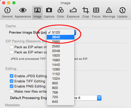
At the Image tab, you can now set the preview cache size at 3840 and 5120 pixels, enabling support for the new ultra-high-resolution displays, also known as 4K and 5K displays.
Another enhancement can be found on the Exposure tab, under the label of Auto Levels Clipping Thresholds. In one-hundred percent increments, you can set the thresholds for automatically adjusting the Levels tool.
Maybe you need no clipping at all for scientific purposes or cultural heritage photography: set the thresholds to zero. Or maybe you like more punch in your low-contrast images: set the thresholds to higher levels like 0.50 or 1.00. And maybe you like shadows more than highlights or vice versa: set the thresholds asymmetrical. You are in control now!
This addition makes the Levels tool much more versatile.
Miscellaneous Issues
Not in the release notes but I noticed that the Import Images dialog on Mac has got the same sort order options as in the browser. On Windows, this already existed since Capture One 8.0, but now it is there also on Mac.
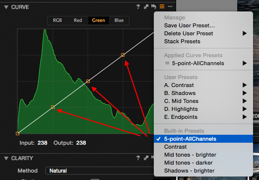
Another nice enhancement is for the Curve tool. Under the built-in presets for the Curve tool you’ll find the 5-point-AllChannels preset for easier adjusting. Apart from both the endpoints of the line, 3 extra points are added as handles.
Another improvement I noticed during testing was that custom aspect ratios you make for the Crop tool, are no longer stored in the program’s general preferences. Instead, there is a distinct folder in the application support folder with one file, User Aspect Ratios.xml. This is new for Mac, as Windows already had this stored in a similar way (not XML-based, by the way). The benefit of a separate file is that you can save and copy it to another computer.
Invisible
To close this review, I like to point you to the remark in the release notes about general under-the-hood improvements for tethering. It’s a bit cryptic, but expect a better user experience while tethering.
Last but not least, this point update resets the trial counter. So in case you have tried it before and your trial period has ended, you have another 30 days to make up your mind.
Conclusion? Matured!
My overall impression of the enhancements in Capture One Pro 8.2 over its predecessors 8.1 and 8.0 is that version 8.2 is more mature. The tools and features that got a make-over are of a high level that they will serve all levels of users in general and the professional in particular.
Interested in more? Capture One Pro 8 continues to evolve. Look for the Capture One Pro 8.3 review here.
Thank You
For reading. Please feel free to leave a comment. Like us on Facebook or subscribe to our newsletter to stay informed about new blogs.
Best Regards,
Image Alchemist











Excellent presentation, Paul. Thanks
Thanks Ario, good to see you around here.
Detailed and fast overview — Thanks!
Thank you, Alex. Great you liked it.
I think I will like all the improvements, but the dynamic locations is a god-send!
I hope C1 will improve in the area of denoising soon. (not that it is bad, but wildlife photography especially birding often requires severe cropping, fast shutter speeds and consequently high-ISO or recovering shadows, etc., I think you know what I mean…)
Thanks a lot for your post.
Hi Marc, I understand your requirements for noise reduction improvements. Bird photography is extremely challenging and noise is often one of the deal breakers in the game.
Thanks Paul, and yes. I like C1 so much, and the company and you associates and forum members, but I have to admit that I am not sure I will stay long-term for exactly that reason. Not sure that the demand or pressure from the user base is high enough to give that area a higher priority, but maybe that’s because the birders out there just did not choose C1 for that very reason…
Nevertheless, a sophisticated noise reduction is beneficial for everyone, so I am still in the “phase of hoping”…
Regards, Marc
I understand where you are hinting at. There is a constant pressure from both users and competitive products, compared by the same user group.
Maybe a blog on noise reduction would help? If you are interested you can give input through text and/or images. Serving the user, is what this site is about.
Hi !
Very nice job on this overview !
Capture One, since i use it (V3), improves on every version.
The new Color Balance Tool is very impressive !
Regards,
Thomas
Thanks Tom, nice to hear you like both CO Pro 8 and the review.