Capture One Workspace
The Capture One Workspace is extensively adaptable to your workflow. Customization is straightforward. Because Workspaces can be saved you can quickly adopt Capture One to your workflow, whether you are shooting, sorting and selecting, editing or processing your images.

Capture One Workspace
The user interface of Capture One consists of a number of components, like Tools, Viewer and Browser. You probably are familiar with their layout and location in the program. However, the entire layout is not as static as you might think. You can change it to a high degree to adopt Capture One to your way of working.
In this post, you learn the components that make the Workspace, how to alter the Workspace, which Workspaces come built-in, and how to save and retrieve a Workspace.
Note: You can distribute your custom Workspaces to other machines for consistency.
Workspace And Workflow
The flexibility that the Capture One Workspace provides is not just a fancy feature. It is at the core of what Capture One is: a raw workflow and processing tool.
One moment you are shooting tethered to your laptop and you do not need all the tools for editing and processing. Next moment you are editing and processing your captures on a dual monitor setup and do not need the tools for capturing.
During these two different parts of your workflow, you are best served with a Workspace that suits you in each moment. These are just two of many examples where your Workspace changes with your workflow.
Workspace Parts
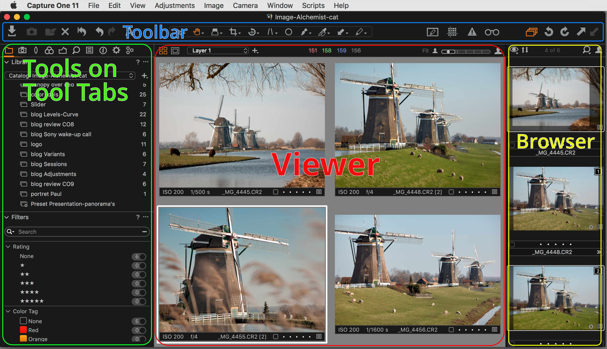
To understand the Capture One Workspace and its power we first take a look at the four parts it is made of:
- Toolbar with icons
- Tools on Tool Tabs
- Viewer
- Browser
I will now introduce each part briefly. Please note that I explain all parts later in greater detail.
Toolbar
The Toolbar is always at the top of the screen, just under the menu bar. On the Toolbar, you find icons for quick actions and in the middle a block of Cursor Tools. These cursor tools are a fixed set, which you can not alter but you can move or remove the entire section.
You can customize the layout of the Toolbar, move icons around, or add and remove icons. You can also hide the Toolbar. In the screenshots above a show you three different Toolbars from respectively the Default, Simplified and Simplified – Tethered Capture built-in Workspaces in Capture One Pro 11.
Tools
There are so many tools in Capture One that they are stored on different Tool Tabs. The Default Workspace of Capture One 11 has 10 Tool Tabs that contain 49 different tools. Some tools like the Histogram and Layers tool are represented multiple times on different Tool Tabs.
In the comparison below you see the Tool Tabs with Tools of the Default and the Tethered Capture built-in Workspaces. Notice the missing Tool Tabs on the right and the selected Tool Tab, when you apply the Workspace.
Tool Tabs and Tools are configurable beyond your imagination. You can change the order of tabs, add and remove tabs, change order of tools on each tab, add and remove tools on each tab, expand and collapse tools on the tabs. There are some hidden predefined Tool Tabs as well.
Tool Tabs are placed at the left in the Default Workspace but you can switch them to the right. If the Browser was there, it will automatically move to the left. You can also hide the Tool Tabs or auto-hide them.
Viewer
The Viewer shows a preview of the selected image – or Variant as Capture One calls it – that reflects your adjustments as how it will be when you export or process it. The preview is surrounded by a Margin or Proof Margin (toggle). The width of both is adjustable from the Preferences.
The Viewer can run in Primary or MultiView. In the latter case, up to 12 Variants are shown when multiple images are selected. Each image or Variant has a label underneath it that you can hide, with its file name, main EXIF data (left) and Tag/Rating status (right).
The Viewer toolbar at the top contains the Primary/MultiView toggle and Margin/Proof Margin toggle at the left, followed by the Layer selector. At the top right, you see the slider for zooming in and out. You can hide the Viewer toolbar.
Browser
The Browser shows you the thumbnails of images in the selected Folder or Collection (in the Library tool). The Browser is placed below the Viewer or at the right. If at the right, it will automatically switch to the left is you place the Tools at the right as mentioned in the Tools section above.
Each thumbnail has a Tag/Rating status below it and file name below that. This is Browser Label and you can change its function and appearance.
The Browser toolbar at the top lets you select three different modes – Grid, List, Filmstrip – and offers a drop-down list to sort the images. At the right, there is a search field and the slider for zooming in and out. You can hide the Browser toolbar.
Pro Only
The ability to fully customize your Workspace is a feature of Capture One Pro (including Pro (for Sony) and DB). Capture One Express (for Sony) has a fixed Workspace that you can not alter.
Change Your Workspace
There are two ways to change your Workspace. The shortest route is to go to the built-in Workspaces. The other option is that you change your Workspace manually. I will look into both options.
Built-In Workspaces
To find the built-in Workspaces, go to Window menu > Workspace.
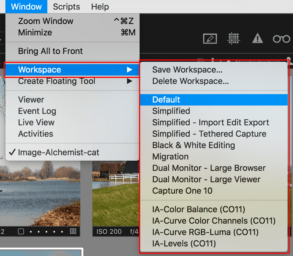
Here you find a list of nine predefined Workspaces. Chances are that one fits your needs, either partly or entirely. Do not be afraid to change your current Workspace if you run the Default Workspace. You can easily go back to it.
Be warned when you already altered your Workspace manually. You should save it first. I come back to that in a minute. Ohh, you already found the Save Workspace command on the same menu. Great, after all, it’s no rocket science, is it?
Looking at the built-in Workspaces, you see the Simplified Workspaces, one general and two specific for capturing and editing in particular. They are great for getting started with Capture One. The Migration Workspace was made for Lightroom converters to make Capture One Pro look more familiar.
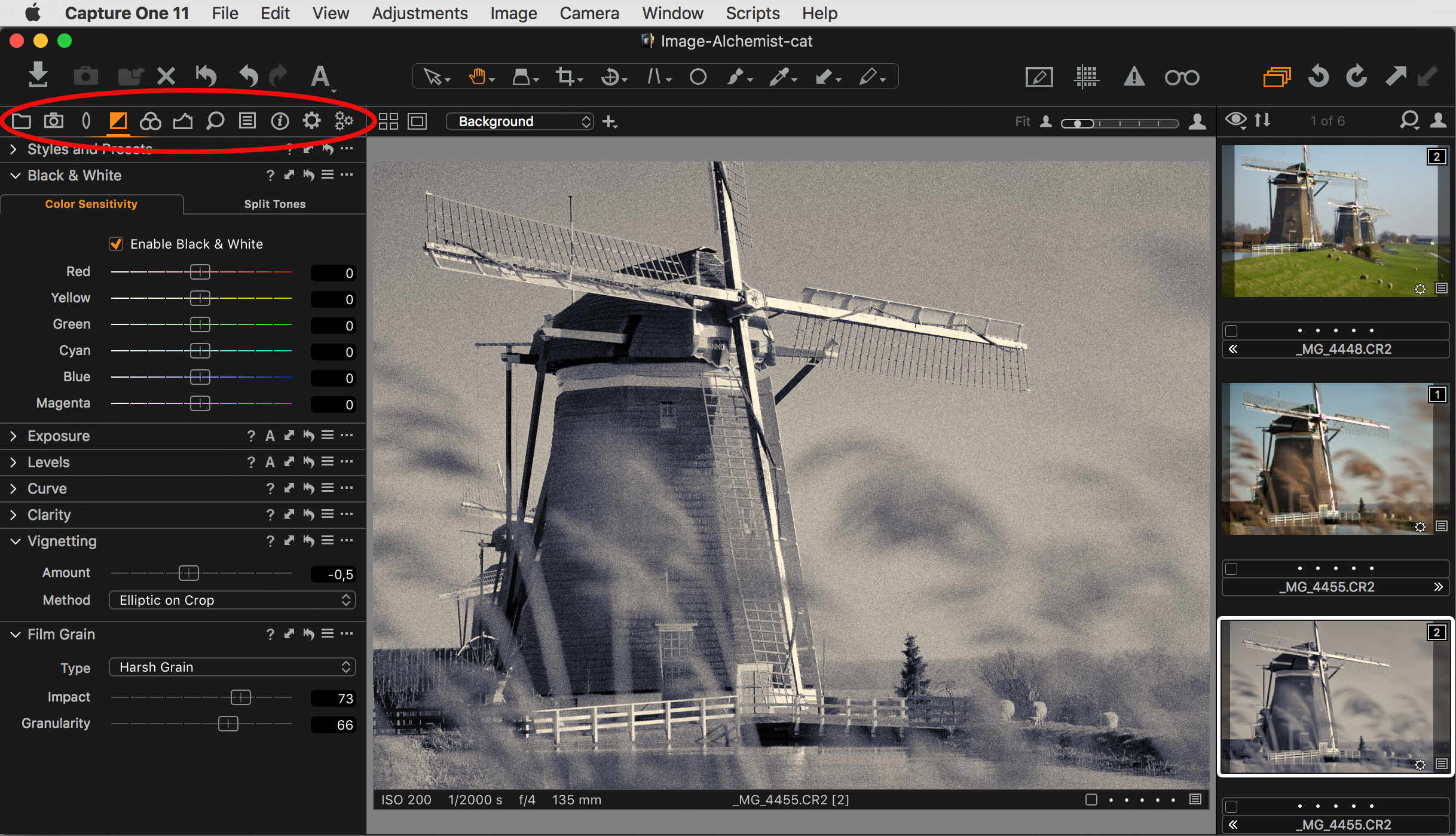
The Black & White Editing Workspace is obviously a special purpose Workspace. Very interesting to see how a particular type of imaging or editing translates into a Workflow and accompanying Workspace.
Tip
In case something unintentionally happens to your Workspace, just go to the Window > Workspace menu and select your Workspace to bring all back to normal.
Build Your Own Workspace
Here is where the fun starts. As you know now, you can always go back to one of the built-in Workspaces with a mouse click, so feel free to experiment.
To explore building your own Workspace, it is best to become familiar with the View menu. In addition, there are several right-click options from inside the Workspace, which we will cover along the way.
Not all parts of the View menu are interesting – is a huge menu – and we will focus on the Viewer, Browser, Tools, and Toolbar sections.
Customize Toolbar
Go to View menu > Customize Toolbar or right-click on the Toolbar and select Customize Toolbar. Either way, a big screen rolls down from the Toolbar with all available options.
You can now simply drag any item from the screen to the Toolbar to add that icon, or vice versa to remove. You can also change the order of icons on the Toolbar or add (Flexible) Space.
As you will notice, the Cursor Tools item is a single item that itself can not be configured. And please neglect the Show option in the bottom left corner. It does not work.
Customize Tools
Both Tools and Tool Tabs are two different items but so strongly related that I discuss them together.
You can hide (or show) the Tools or place them at the right. The Tools Auto Mode is a bit of a mystery but very interesting at the same time. Try it and you’ll notice that when the Tools disappear a small triangular shape comes as a replacement.
Move your mouse to the (left) side and notice the Tools suddenly appearing without changing the size of the preview in the Viewer. It expands over the preview and disappears when you move your mouse away.
I use the Tools Auto Mode feature often when I am almost done with editing and like the images large on my display for the finishing touch.
Customize Tool Tabs
There are a number of customizations with Tool Tabs. You can add and remove a Tool Tab and you can change the order of the tabs. Adding or removing a Tool Tab can be achieved from the View menu or by right-clicking in the Tool Tab header.
Like an exercise? Just try to add the built-in Quick and Black & White Tool Tabs and remove another tab.
To change the order of Tool Tabs, just Cmd+click (macOS) or Ctrl+click (Windows) and drag the Tool Tab icon to the left or right and drop it at its new position.
Customize Tools on Tool Tabs
You can add Tools to and remove from any Tool Tab. This works from the View menu for the selected Tool Tab. In the Tool itself, you can always select Remove Tool from the Tool’s action menu (3 dots). Changing the order of Tools on a tab is just a matter of dragging one up or down.
Right-clicking on a free area of a Tool Tab opens the same Add/Remove Tool/Tool Tab menu as mentioned before.
Tip
Want to change the width of the Tool Tab section? Drag the separator symbol at the top of the column with the mouse.
Add Floating Tools
Before I step over from Tools and Tool Tabs to the Viewer I have another rabbit coming out of the hat: Floating Tools. A Floating Tool is the same tool but now freely floating on your screen, typically the Viewer area, and not on a Tool Tab.
You find the Floating Tools in the Window menu > Create Floating Tool. You can also drag the Tool from the Tool Tab. It then becomes a Floating Tool.
Note that you can combine Floating Tools. They connect automatically when one comes in the neighborhood of the other, like magnets. You can also collapse and expand Floating Tools, just like regular Tools.
Customize Viewer
The Viewer has a few customization options: Hide, Hide Viewer Labels, Hide Viewer Toolbar, and open a second Viewer.
In the Viewer section of the View menu, you find all most all options. Most important is the ability to hide the Viewer altogether. This is great if you are in the sort-and-select phase of your workflow. This gives your thumbnails all the space on your display!
Another reason to do this is that you work on a dual monitor setup. I come to that in a minute.
Minor settings you might want to change is whether you like to have the Viewer Toolbar (top) and the Viewer Labels (bottom). Also, the state of Primary/MultiView is part of the Workspace and saved along with it.
Opening the second Viewer is not an option in the View menu. Instead, go to the Window menu > Viewer instead. The second Viewer is also part of the built-in Workspaces for Dual Monitor. Notice that there are two Dual Monitor Workspaces; Large Browser and Large Viewer. They both use the second Viewer window: for the Browser and the Viewer respectively.
Customize Browser
Looking at the Browser section of the View menu, you see similar options as for the Tools. You can hide the Browser if you work on a single image or have selected a few images and put them into an Album for example.
The Browser Auto Mode feature is similar to the one I explained for the Tools. Swapping your thumbnails around is great fun: Place Browser Right or Place Browser Below let you optimize your screen real estate depending on whether you have images with a landscape or portrait orientation for example.
Special attention for quite unknown feature of the Browser: the Browser Labels. You can switch them Off, Edit mode, or Status mode.
Edit mode Browser Labels is the most common option where you can edit the Tag/Rating and file name from the Browser. Status mode prevents changing the Tag/Rating but leaves the file name open for alteration. Browser Labels Off speaks for itself: you get clean thumbnails, without labels.
Browser Viewing Modes
Another aspect of the Browser is the viewing mode: Grid, List, or Filmstrip Mode. The Grid Mode is the default and reminds me the most of the old contact sheets. The width adapts to the screen and rows of thumbnails are stacked on top of each other. You browse up and down. Grid Mode is also great when you hide the Viewer and have you thumbnails all over the screen.
Filmstrip Mode may look initially similar but is like the name says, a filmstrip. It is one large row that you can scroll from left to right and vice versa. Filmstrip Mode is not available when you hide the Viewer.
List Mode does not focus on the image, as it is displayed incredibly small. It is the mode that shows the most metadata of your images in columns. By clicking the column header, you sort for the property.
Save And Retrieve Your Workspace
Now that you have carefully crafted your custom Workspace, it is time to save it. Note that when you save a Workspace its status is exactly saved. Meaning that when you select it later – after you have worked with another Workspace for example – the selected Tool Tab is as when saved, as are the collapsed and expanded tools on each Tool Tab.
To save go to the Window menu > Workspace > Save Workspace. Give your new Workspace a meaningful name. Note that when you improve your own Workspace and like to replace the older, you just save it using the same name from the drop-down list.
When you like to select your Workspace, you will find it below the built-in Workspaces, separated by a line.
Last, cleaning up not wanted custom Workspaces is as easy as saving. Go to Window menu > Workspace > Delete Workspace and select a Workspace from the drop-down list. Note that you can not delete any built-in Workspace.
Distribute Your Workspaces
You do not want to lose your custom Workspaces and you might also want to align the Capture One systems in your organization. To accomplish this is to save your Workspace folder and copy it to other computers or a backup disk.
Workspaces are stored inside the user context on a computer, both Windows and macOS, in the so-called Application Support folders. Its parent folder is hidden by default, so you have to unhide to be able to access it.
In my post on Installing Presets And Styles, I explain how to access the Application Support folder for Capture One. Like Presets, the Workspace folder is inside this folder.
Other Resources
On the Phase One blog you find a series of posts on Workspaces by Phase One staff with accompanying Workspaces for download. Great tips and great examples!
And here the Image Alchemist you can get Workspaces for download as well in Tabbed Tool Workspaces. These Workspaces demonstrate what you can do with it. I use Tools with tabs, like the Levels tool below a lot. but switching between tabs not. Why not put them all together on a separate Tool Tab?
I made Workspaces for the following Tools with tabs:
- Color Editor (CO11)
- Color Balance (CO11)
- Levels (CO11)
- Curve RGB-Lima (CO11)
- Curve Color Channels (CO11)
All Workspaces in this download are based on the Default Workspace minus the Capture Tool Tab to create some space. Please note that you can simply add the removed Tool Tab.
Have fun with Workspaces. Knock yourself out!
Thank you
For reading. Please feel free to leave a comment. Like us on Facebook or subscribe to our newsletter to stay informed about new blogs.
Best Regards,
Image Alchemist










I came here looking for a way to change the image labels in the Viewer window. The C1 default seems to be: ISO, shutter, f-stop, focal length, and image name. My workflow needs Date and Time in addition. Is there no way to add those data? I have looked and looked, without success.
Hi Starman, unfortunately you can not configure what is in the Viewer labels.
Best, Paul Steunebrink / Image Alchemist
Hi, thanks this is really useful for me. I’m moving from Lightroom. One thing you didn’t cover is the equivalent of Solo mode in Lightroom. It keeps the workspace clean by auto closing a tool tab when you open another one. So there is only ever one tool tab open. Is this possible in Capture One 20?
Thanks Peter
Hi Peter,
The just-released Capture One 20 (13.1.0) is smarter in this respect, collapsing one tool when expanding another. Also in CO20, is the choice between the pinned and scrolled area for your tools. Both new features are not in this blog. I hope you can try them out. The Capture One workspace is extremely configurable, in particular when compared to Lightroom.
Best, Paul Steunebrink / Image Alchemist
Hello Paul, how do I set the preference to collapse unused tools when I expand a tool? I have the latest update and use all my tools in a custom tab scrollable area and would like for my tools to automatically collapse when expanding the one in current use.
Hi Francisco,
In Capture One 20 you have a pinned and scrollable area. In the scrollable area, tools do not collapse when others expand, as per design, in contrast to the pinned area. There is no preference setting with regard to expand/collapse of tools.
Best, Paul Steunebrink / Image Alchemist
Got it, thanks for the response. I’ll try it out and pin the tools in my custom tab and see which I like best I’m sure I opted to the scrollable area for a reason but can’t remember why. Thanks again.
Not getting it to work the same way as LR, when I pinned the tools and expand I can expand 3 or 4 tools before one (first tool I expand) collapses then when I start collapsing the tools from last expanded the tools that were previously collapsed start expanding again.